The problem: The most valuable asset wasn't positioned as the product
NonFungible is an NFT analytics platform with a large amount of data accessible for free.
The product was built for people who already understood NFTs. It worked for insiders. They trusted the data and didn't need much explanation.
But the business didn't rely on insiders.
Revenue came from companies entering the NFT space from other industries. Teams with budgets, but no context. These were the users we needed to convert.
And for them, the product failed at first glance.
The reports, the most valuable asset, were buried. The service offering was hard to understand. The experience felt inconsistent and not credible enough for companies making serious investments.
What looked like UX and UI issues were symptoms.
The real problem was simpler. The product was built for the wrong audience.
This changed the scope of the work. Instead of improving flows, I had to restructure the product around what actually drove value and aligned with the business.
The insight: The product explained data, but not itself
The product was solving for curiosity. The business depended on trust.
This gap showed up immediately.
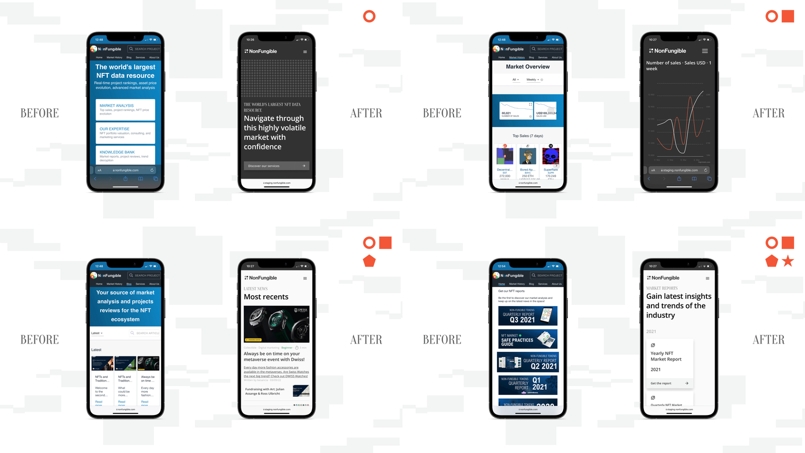
The website didn't explain what NonFungible did or why it mattered. The headline and subheadline were unclear, and first impressions felt confusing and not credible.
At the same time, user behavior told a different story than what the product was built for. Most users focused on reports, news, and top sales. Large parts of the platform were rarely used, even by engaged users.
The issue wasn't just how the product worked, but what it prioritized.
The process: Repositioning the product around what drives value
The core product was hiding in plain sight
The reports were already driving the business.
Every large client came through them. When I spoke to users and ran surveys, they consistently pointed to market reports as the most valuable part of NonFungible.
But in the product, they felt secondary.
Reports were hidden behind a small widget, with no clear way to explore or understand them. Users landed directly on a payment flow, with no visibility into other reports. There was no way to access or browse older reports.
I repositioned them as the center of the experience.
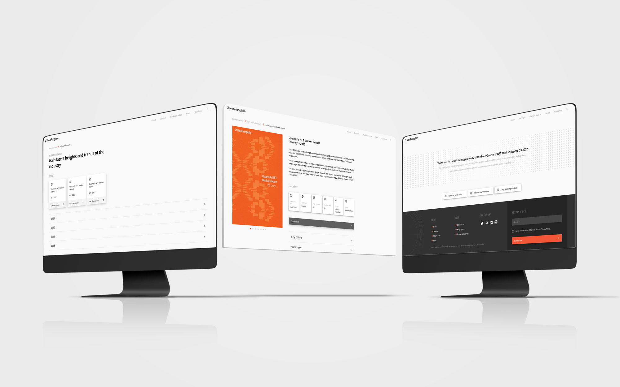
A dedicated section to browse all reports. Individual pages that clearly presented their value. A purchase flow that treated them like a product, not a download.
This made the value visible and the path to purchase or free download clear, which contributed to increased report discovery and purchases after launch.
The service model was creating friction instead of clarity
Users had to understand multiple services, then request them one by one.
I simplified the structure by shifting from services to personas.
Instead of navigating categories, users could identify themselves directly. Collectors. Companies entering NFTs from other industries. Press looking for tailored insights.
This removed the need to understand how the company was structured before taking action, and made it easier to engage with multiple services in a single flow, contributing to an increase in business requests.
The platform lacked credibility for new users
The experience worked for insiders. It didn't work for newcomers.
For companies entering the NFT space, the platform felt outdated and unclear. It looked like a tool built by developers, not a company they could trust with serious budgets. It wasn't responsive, the structure was inconsistent, and it was hard to understand what NonFungible actually offered or how to engage as a business.
This wasn't just a design issue. It was a credibility issue.
I redesigned the experience to meet those expectations.
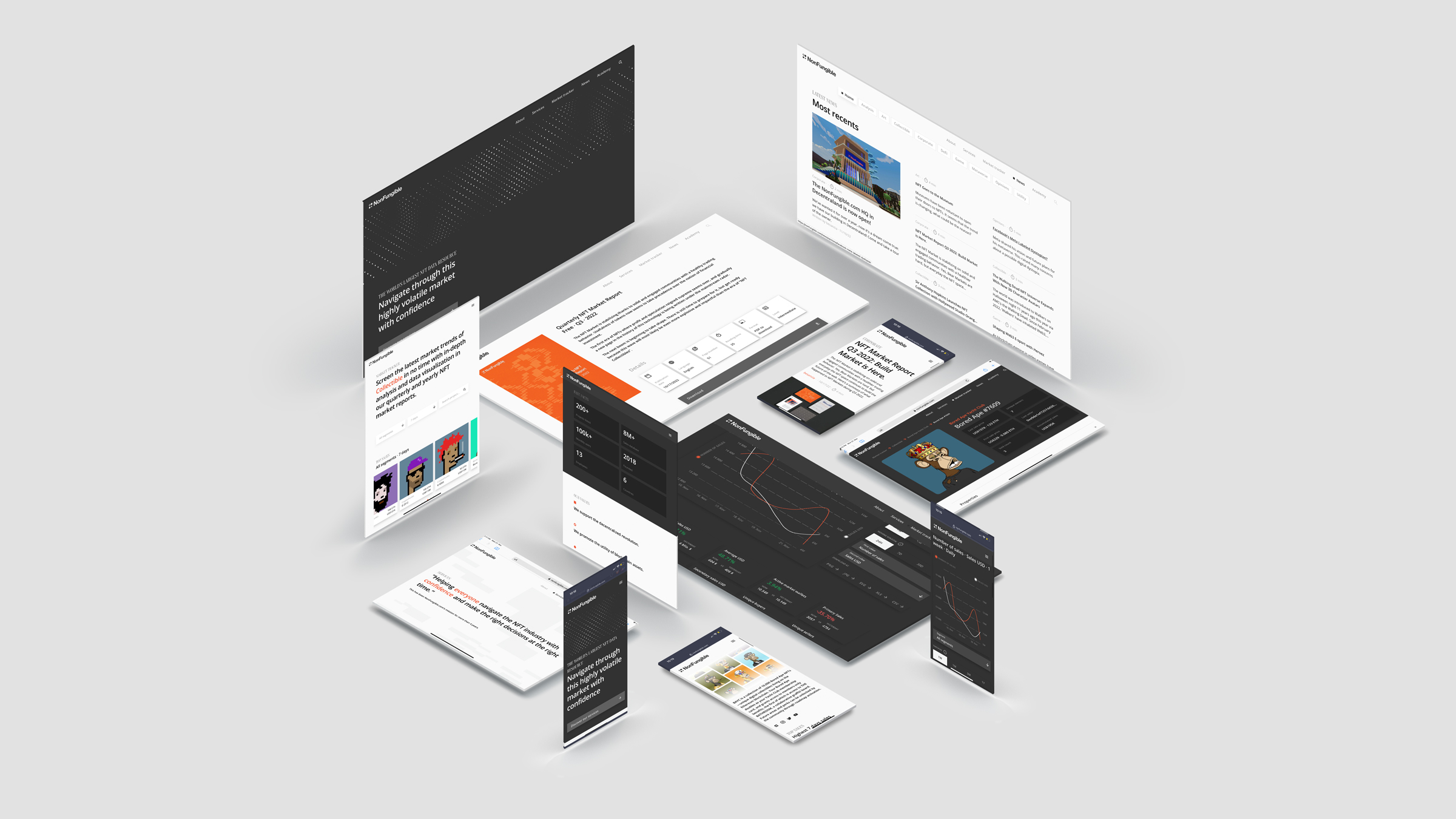
I introduced a clear homepage explaining the platform and its value, along with structured "About" and press sections to make it easier for companies and media to engage. At the same time, I rebuilt the visual system and redesigned the report experience to feel like a high-value product.
This increased trust and willingness to engage, leading to conversations with larger companies.
The goal was not to look better. The goal was to feel aligned with the level of clients we wanted to work with.
The experience was inconsistent across channels
This wasn't just a redesign. It was a coordinated release.
Before this, marketing, content, and social operated independently, resulting in inconsistent messaging across channels.
I aligned everyone around a single communication plan.
We defined shared messaging, visual assets, and key statements reused across the website, newsletter, and social media, making the launch more coherent.
I also used Twitter as a lightweight feedback loop to identify what users cared about and inform content structure, especially in the newsletter.
We redesigned the newsletter accordingly, prioritizing the most relevant content. This led to higher engagement and reinforced a clearer positioning across channels.
The result was smoother collaboration, faster execution, and a more consistent experience from first touchpoint to product, strengthening overall perception.
The outcome: Business impact after the redesign
Within four months, the impact was clear.
We also started conversations with larger companies, including Warner Bros and LVMH.
This signaled a shift in perception. The product was no longer seen as a niche tool for insiders, but as a credible partner for larger organizations.
This happened as the NFT market was already declining. While these conversations didn't convert, they showed that the repositioning worked even in a shrinking market.
The reflection: Tying the launch to a key business moment was a risk that paid off
I tied the redesign to the report launch. It was a gamble.
It created pressure and forced us to focus on what actually mattered. We cut non-essential parts of the product, like the NFT academy, to make sure the core experience was ready.
This also aligned with a key business moment. The yearly report is the only paid report, so it's a once-a-year opportunity. Launching at that time contributed to a significant increase in purchases.
If I were to do it again, I would separate positioning work from the launch earlier to allow more space for iteration.
That said, the constraint helped clarify priorities and focus on what would actually move the business, and ship that first.