The problem: Designed for France, scaling into Germany
Evaneos is a travel marketplace where users don't book instantly. They submit a request, get matched with a local agent, and receive a tailored itinerary. The request form is the business model. No submission means no lead. No lead means no revenue.
In 2024, Evaneos signed a €1M marketing campaign in Germany. Traffic was about to grow sharply. But the product had been built for France, and German users arrived with higher reassurance thresholds, shaped by a Trusted Shops culture, while Evaneos had little brand recognition there. Key parts of the experience didn't align with what those users expected around trust, clarity, and reassurance.
This misalignment was the main risk before scaling. But the brief was a single sentence: make the product ready for the German market. No roadmap, no defined problem, no prioritised list. Two three-month cycles to design and validate, then two months for the company to implement, with the campaign going live in September. One PM, one designer, limited engineering. Before any design work, the first job was deciding where to point six months of effort, fast enough to still have time to spend it well.
.gif)
The insight: High-intent users dropping at the moment of commitment
Early analysis of the funnel revealed a 71% drop-off at the final step of the request form. These users had explored destinations, browsed agencies, worked through most of the form. They were at the point of highest intent. Then they left.
Our first assumption was straightforward: the last step asked for too much, too soon. Users hadn't seen a quote or an itinerary yet, but we were already asking them to create an account and hand over personal details. The drop-off, we believed, was effort and commitment arriving too early. It was the obvious read, and every UX heuristic agreed with it.
We were wrong.
Surveys embedded in the flow and user interviews surfaced a different pattern. The same four questions kept coming back, almost word for word:
- Why do you need all this personal information?
- Who am I actually talking to?
- What happens after I submit?
- Is this quote binding?
These weren't friction complaints. They were trust questions. Users weren't overwhelmed by the length of the form; they were unsure what they were signing up for, and some genuinely suspected a scam. The problem wasn't effort. It was trust, and a lack of clarity about the task itself.
Trust broke in specific, traceable ways. Users entered their email expecting a quick quote, then hit a screen demanding full personal details, a shift that felt like a bait-and-switch. Users who had arrived from an agency page had already seen a real agent's face; the form then showed a generic avatar with no explanation. An external audit had flagged this perception months earlier.
The issue wasn't effort alone. It was a gap between what users expected and what the form delivered.
The process: A failed experiment, a research pivot, and a redesign
The form was so outdated that engineering couldn't touch it without risking a break. Most of the first cycle's development capacity went into migrating it to a new stack, which meant, for three months, almost no engineering available for design changes. So we adopted a simple rule: if we can't build, we buy information instead. Test cheaply, learn fast, and spend the rebuild budget only once we knew what to build.
Testing the entrance
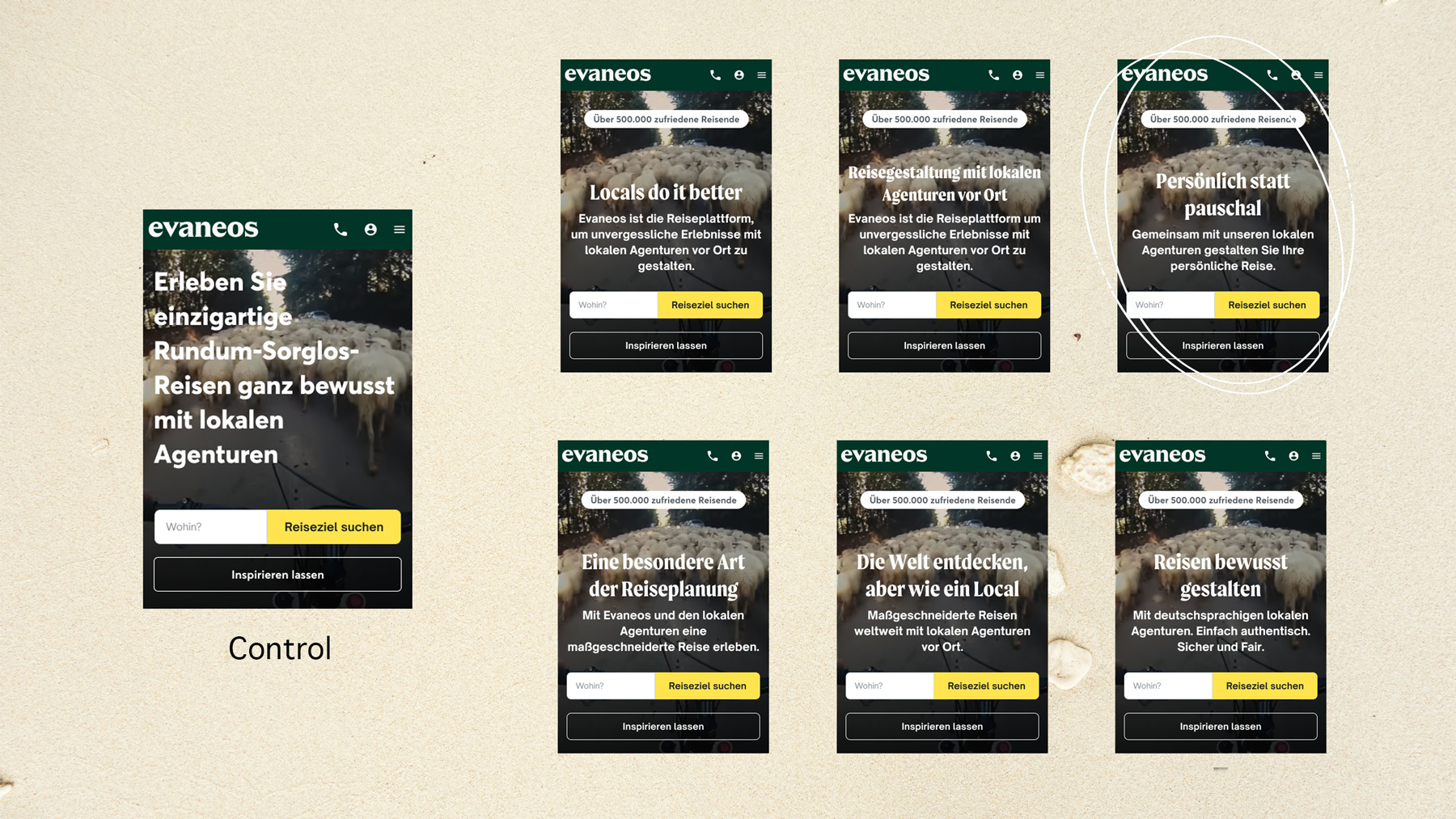
Before touching the form itself, we tested whether we could simply push more people into the funnel. We A/B tested CTAs across destination pages (copy, placement) to lift the number of users starting a request. Results were modest: up to 13.8% uplift on some pages, but limited overall. The takeaway wasn't the number, it was the direction it pointed. We couldn't meaningfully grow the top of the funnel. To move the needle, we had to fix what happened inside it.
Testing the obvious fix
To test the friction hypothesis without paying for the real fix, we simulated it: hid fields on the final step and A/B tested the lighter version against the existing form. The results came back flat, almost no movement on the 71%. On its own, that's a wasted cycle. But research had been running in parallel from day one, not waiting for the experiment to finish. By the time the test came back flat, we already understood why: the four trust questions had surfaced in interviews and in-form surveys weeks earlier. The failed experiment didn't send us back to the start. It confirmed the hypothesis we'd already replaced.
The research that ran alongside
The research layer didn't exist, so we built it: ten one-hour interviews with people who used travel agencies but had never travelled with Evaneos, each session a hybrid of interview and usability test; two Hotjar surveys embedded directly in the form, catching people in the moment rather than in recall, for 150+ responses; behavioural tracking on key pages; and competitive testing of how alternatives handled the same moment.
I opened each interview with a hypothetical rather than the product: you've won €10,000 to plan a trip to Tanzania, how would you go about it? This surfaced people's real mental models and planning tools before Evaneos entered the conversation. Then I asked them to do the same on Evaneos, and to genuinely submit a request (deleted afterwards). We were watching the real journey, not a demo of it. That one decision, real submissions rather than simulated ones, is what later surfaced a problem nobody had asked us to look at.
Quick wins between cycles
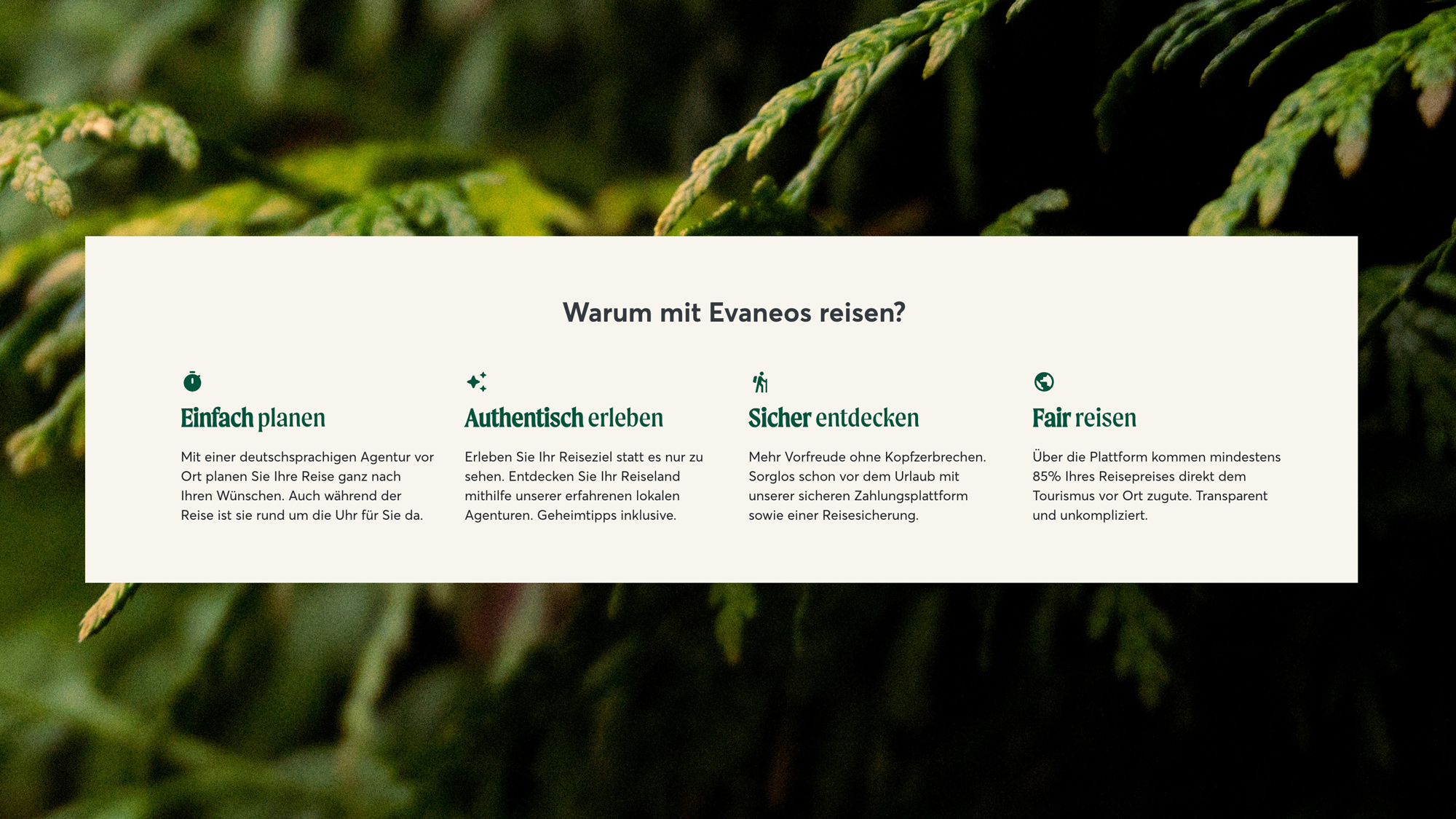
In the meantime, we spent the little available capacity on validated quick wins. I removed the generic avatar from the form; the mismatch with the real face users had just seen was actively breaking trust, so hiding it was the right first move. We reframed two questions testers consistently misread, brought the footer up to German cultural standards, and I designed a "what is Evaneos" block for the homepage, placed high, to explain the process to people who'd never heard of the brand. Not side projects, but the same strategy executed in the gaps between experiment cycles.
Getting the second cycle: the stakeholder case
The first experiment had failed. Now we had to ask the CPO and the DACH country manager for the second three-month cycle, on the same funnel, on the core of the business, weeks before €1M of traffic arrived. That's a hard ask right after a flat result.
Three things carried it. First, criticality: this was the business model, and the leak was exactly where the campaign traffic would land. Second, confidence: our conviction in the problem had gone up even though the experiment had failed; the research told us the friction fix was never going to work, and why. Third, and the part that actually closed it, we de-risked the ask. We didn't request an expensive rebuild on faith. The deal was quick testing first, then a no-code version of the new form with a share of real traffic redirected to it, which required separate sign-off from the product lead. The trade-off, named out loud: rebuilding was costly in engineering and risky for the business, so we bought proof in production before spending the budget. Stakeholders rarely reject evidence. They reject unbounded risk.
Redesigning the flow
The redesign made four changes to the flow, each answering something the research had surfaced.
A step before the form. We added an entry screen explaining what the form is for, what Evaneos offers, how long it takes, and that it's free, with Trustpilot and Trusted Shops ratings placed right there. This answered is this quote binding? and cleared up what the task actually was before any effort was asked. The trade-off was deliberate: we knowingly added a step to a funnel we were trying to unblock, betting that clarity up front would outperform brevity.
The greeting screen. Hiding the avatar had fixed the confusion but stripped out the human element. So instead of leaving it hidden, we reframed it: a greeting-style screen that reintroduced the real agent and asked only for first and last name in return. A human exchange rather than a form field. It answered who am I talking to? and moved two required fields out of the heavy final step.
One step, one question. We restructured the form from grouped fields into a progressive, one-question-per-screen flow. It paced the commitment into small, manageable steps, matched how every major competitor structured their forms, and resolved a device split: Germany skewed desktop, but most other markets were mobile-first, and the old grouped layout broke on small screens. One system, all devices.
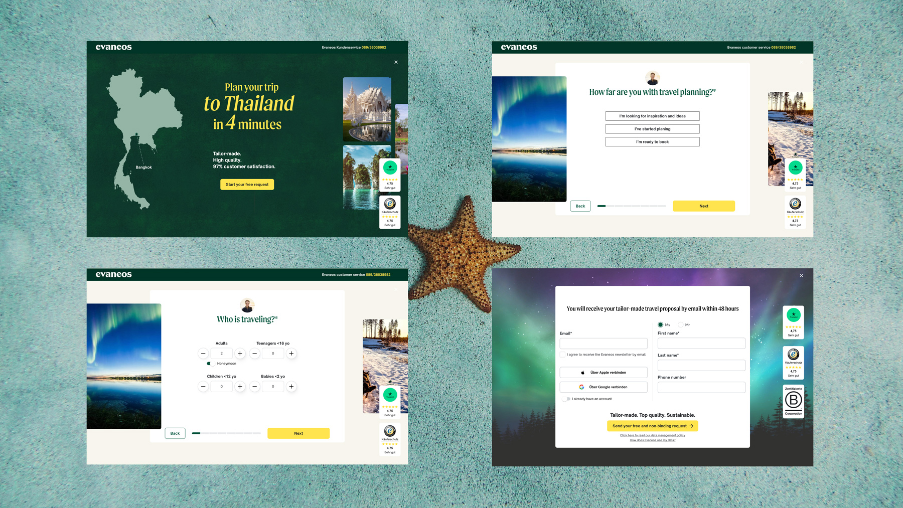
Reassurance at both ends. Reassurance fades as a multi-step form goes on, so we placed it at both ends. Trustpilot and Trusted Shops ratings sit at the entry, where the user decides whether to start, and again at submission, where they decide whether to commit, alongside an explicit reminder that the quote is free and non-binding and a one-line value statement.
Every error message, rewritten. I also rewrote every error message in the flow. The existing ones were vague, generic, or simply wrong, telling users something had failed without saying what or how to fix it. Each one now names what happened, in which field, and what to do next.
Closing the loop: the success screen
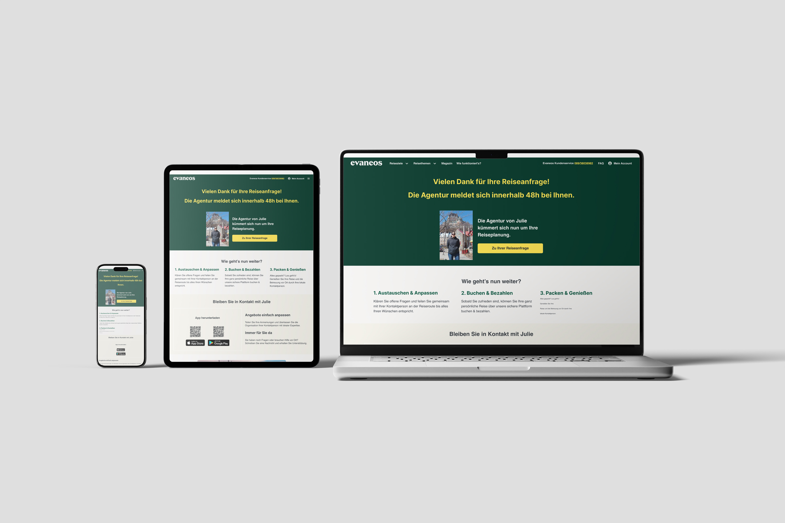
This is the problem the real submissions surfaced. Because testers actually completed requests through the existing flow, I saw the success screen they landed on, and it was broken. It promoted account-creation benefits to people who had just created an account. A CTA promised to take you into your account but led to the homepage. Nobody owned it. The screen meant to answer what happens after I submit? was outdated, contradictory, and disconnected from the experience we'd just rebuilt.
The success screen wasn't in our scope. We'd set out to fix the form, not what came after it. But the evidence said the problem didn't stop at submission, so we took the screen on, redesigning it around what users told us they needed to know: what happens now, when the agent replies, what to expect from that first exchange. Extending scope in the final cycle against a fixed deadline was a real trade-off, justified because the metric that mattered wasn't submissions, it was conversations actually starting. It launched at the very end of the engagement, so we couldn't isolate its individual impact in the data.
The outcome: Measurable improvement across the funnel
The headline is the −40%, but the numbers are more interesting read together than alone.
Drop-off actually rose at the new first step, and that was the point. People who weren't in the right place now left early, before investing effort, instead of abandoning at the final screen where intent was highest. We moved the filter to where it costs the user least. Overall drop-off fell sharply, and time-to-complete decreased despite the added steps: one question per screen cut cognitive load enough to outweigh the extra clicks.
The number I care about most is the last one. +17.8% first conversations means the funnel stopped filtering people out and started setting them up. That lift came from the redesigned flow as a whole, including a success screen that finally told people what happens next. It launched too late to isolate on its own, but the direction is unambiguous: the journey no longer ended at submission.
The reflection: Good decisions come from killing the wrong ones early
Two cycles, one lesson: the failed experiment made the successful one possible. Cheap tests bought information while engineering rebuilt the foundation. Research running in parallel meant a flat result still moved us forward. The second cycle was ambitious because it was informed, and it got approved because it was de-risked.
The second lesson is the one I'd carry into any project like this: we trusted the users over the rules. Conventional UX wisdom says shorten the funnel, remove steps, cut fields. The first cycle did exactly that, and it did nothing. The research said the real problem was trust and a lack of clarity about the task, so we did the counterintuitive thing and added an introduction, a greeting, reassurance at both ends. We challenged the heuristics when the evidence pointed the other way. The users were right.
That's how I work: fast cycles, clear hypotheses, decisions grounded in real behaviour. I don't aim to get it right on the first try. I aim to learn fast enough to reach the right problem. Each iteration makes the next decision more informed, which is what moves the work from the obvious fix to the accurate one.